My Work
NEW EXPECTATIONS
What do you create when given the option to make anything? For me, these types of open-ended projects have always been intimidating. I get overwhelmed by the possibilities, afraid my current idea isn’t good enough to take advantage of the opportunity, although, surprisingly enough that was not the case when it came to my capstone project.
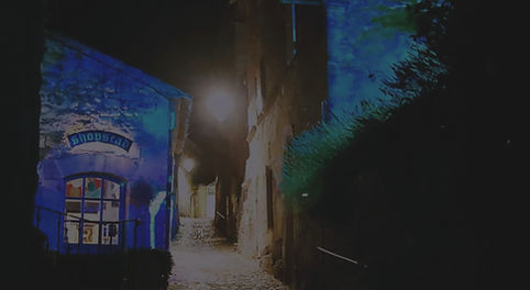
lES NOCTURNES
SCAD LACOSTE
20TH ANIVERSARY
Over the course of three short weeks in June 2022, I had the incredible opportunity to return to SCAD’s Lacoste campus, to develop the installations featured in SCAD Lacoste’s 20th Anniversary Celebration: Les Nocturnes. I worked alongside a small group of my peers to create projection visuals inspired by the beauty of Provence.
HALLOWEEN
title redesign
I am a big fan of Halloween, both the movie and the holiday, however the titles, although iconic, could have had more fun with the themes of the film. In my reinterpretation of the title sequence, I focused on creating a sense of foreboding that matched the theme music, and tone of the film pulling from the creators' concept of testing how far you can stretch a rubber band before it SNAPS!
OUTLANDER
TITLE REDESIGN
The tv series Outlander tells the story of a woman who finds herself thrown into the past unable to get home. The title design was a collaborative effort to tell her story as if we are reading her diary, taking inspiration from the narrative style of the show. The main character recounts her journey as if she has written it all down, blending it with stories from her time and her expertise as a nurse, and her knowledge of herbalism. The design is of the collision of her worlds, and the continuity she is still able to find, even with her life fractured between the past and present.
FEARS AND CONFESSIONS
Fears and Confessions is a typographic identity design for the publication of the poem ADHD; a List of Fears and Confessions. Chronicling many of the anxieties people with ADHD face, the poem’s rigid power is explored in stark unadorned typographic sequence in both motion, poster, and product design, all meant to call attention to an issue that can feel so isolating.
ASTERIA GIN
Gin is a drink that most people associate with their parents or grandparents. It is outdated and many people even bartenders do not quite understand the appeal, yet it is still the world's most popular liquor and for good reason, it simply does not deserve that. Asteria Gin seeks to change that, with their brand geared towards those coming of age and provide to them an experience where they can determine who they are, and what their gin says about them.
CIPHER BOUTIQUE HOTEL
Visiting a hotel should be more than just a place to rest your head. A good hotel has flair, a great hotel is an experience. Cipher Boutique Hotel is a conceptual brand identity, designed to transport you back to the time of spies, romance, and mystery. At Cipher you enter with a romanticized nostalgia, much like a James Bond film, to a vacation with each aspect curated to enhance your experience.